Friday, 7 February 2025
and we were struck by consumerist f🍅😒👌ttry again
https://webflow.com/blog/y2k-aesthetic
blatant and profound mental r🙈😌😳😁on
Tuesday, 19 March 2024
DesignerCriticism VOL 1
Y2K(at least how they assume it looks like) ≠ the same aesthetic used during the golden age of web design.
today we are criticising this generous crappy website propaganda by WiX STUDIO.
offended nearly non-stop from all of this nonsense
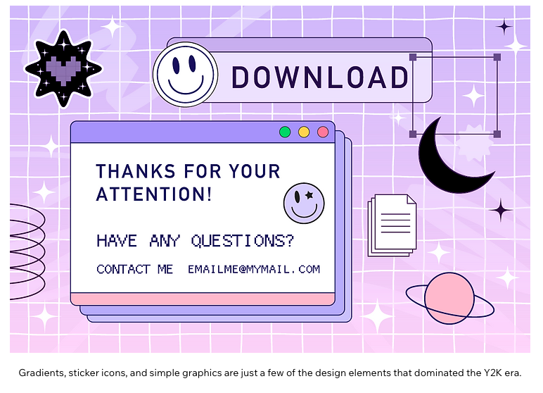
Landlines. iMacs. That screeching sound of dial-up internet that had us waiting to sign online. 2000s tech may not be coming back, but the magic of the Y2K design aesthetic of that era sure is.
It’s about time, too. Considering how minimalism has dominated the design landscape since the 2010s, the spirit of the aughts carries with it an energetic air of nostalgia and optimism that we’re ready to embrace. From the resurfacing of Comic Sans, low-fi design and metallics, to major brands like Coach bringing back iconic styles from the era (and 2000s styling to their campaigns)—the Y2K aesthetic is back with even more confidence than the first time around.
What is it about Y2K design that's attracting a new generation of trend setters, and how can you get in on it as web designers? This article will shed light on the hype that is Y2K design, diving into the nostalgic qualities that speak to today’s audience, and showing how you can use this strong-spirited aesthetic to fuel your own web design. so geocities-esque visual vomit is now valid for corporate sites?
next quote:
What defines the Y2K aesthetic?
Prevalent in popular culture from 1997 to around 2005, the Y2K aesthetic manifested an over-the-top futurism that had a strong impact on the timeline of pop culture and design. Hitting on graphic design, fashion, technology, music and more—it was a visual language that embraced the unknown of a new millennium with an optimistic spirit.
In the wake of 90s angst, the generation that survived the Y2K scare absorbed new technologies quickly and sought the untapped potential of computers and the internet. The dynamic style is a sleek and wild visual representation of futuristic concepts that defined the attitude of this time: metallic colors, icy blues, translucent hardware, cyber fashion, and quirky 2D and 3D iconography.
While cutting-edge innovation in tech and the growth of the internet had the strongest influence on millennial designs, the 2000s aesthetic itself also took cues from 60s and 70s nostalgia. The result was a mish-mash of decades—the Y2K designs as we knew them included bright retro colors like orange and lime green, with fashion trends like peace signs, baby tees and bell bottoms also working their way into the cyber mix. One re-watch of the original iPod commercials can give you an idea of the vibe, which is returning to tech, design, fashion, and just about everything.


1. Y2K color schemes
Color is a powerful tool for conveying emotion. Today, designers are using a bold spectrum of colors that pay homage to and evoke the technological seachange of the late 90s and early 2000s: think of the neon palettes inspired by 60s and 70s iconography, the futuristic metallics on Destiny’s Child’s iconic album, “Survivor,” and transparent tones of the chunky iMacs and gameboys.Yeah, especially GameBoy consoles. NICE COMPARISON WIX!
2. Alternative iconography
In today’s quick-paced, visually-oriented generation, website imagery plays a defining role in your website’s appearance and tone, representing the visual language of every brand. But we live in an age of visual overload. The average adult spends about 30 minutes a day browsing Instagram’s whopping 95 million daily-uploaded photos. Website designers need to make sure their sites offer a stand-out visual story in a sea of photographs, illustrations and other imagery. Y2K iconography can come in handy here, bringing an alternative graphic look that’s too much fun not to stop your scroll for.
A quick look at Y2K sticker packs, or a google search of tween magazines from the era shows the optical lexicon that dominated the era: 2D and 3D art, thick lines and shadows, shiny imagery and cheesy, grungy icons like smiley faces and butterflies. These same icons are reappearing in the visual language of today, seen on pop star Olivia Rodrigo’s music website, or all over the Instagram page of Indy fashion brand Beepy Bella and beauty brand Starface. Another fun fact: most of these sticker packs are simply driven by nostalgia, and are not actual representatives of the stickers at the time.
3. Bold type design
2000s type design had a specific infinity for the loud, the bubbly and the adventurous. Often, fonts that put an emphasis on ornamental elements like thick outlines, shadows, bold or italic letters are the kinds of typography that draw us back into the Y2K feeling.
Whether in your web design or implemented into your logo and other branding assets— designers today can implement this style of type design of the 2000s by using nods at recognizable or default fonts (like Comic Sans, Billy, Dazzle, Times New Roman, and more), or simply integrating punchy decorative elements like drop shadows, air brushing or a free-flowing type alignment. And then they inserted a tweet from Y2K Aesthetic Institute, which in this case seems to be out of place. Yikes.
4. Analogue UX
Despite the fact that our technological reality allows us to create complex, smooth designs—there’s a recent surge in UI design where creators are intentionally diving into analogous types of interfaces to achieve a Y2K web design.
Instead of frustrating users, these seemingly dated interfaces remind us of a simpler era, which included asymmetrical designs with flat user interfaces (like the SpaceHey, the newest social media platform which imitates the aughts beloved myspace), or default fonts like Times New Roman against a simple white background. And while, at the time, it was paired with slow loading time and a less personalized user experience, today’s web designers have the best of both worlds. And this was actually true! Congrats WiX this is the only true claim(but it is ruined by comparisons). There goes an example of such work:


-
Y2K(at least how they assume it looks like) ≠ the same aesthetic used during the golden age of web design. today we are criticising this gen...
-
https://webflow.com/blog/y2k-aesthetic blatant and profound mental r🙈😌😳😁on
